
SAT Score Chart 2026: Percentiles, Scale & What It Means
Miyagi Labs ·
SAT Score Chart 2026: Percentiles, Scale & What It Means

TL;DR
The SAT is scored on a 400 to 1600 scale, combining two section scores (Reading & Writing and Math) of 200 to 800 each. The national average sits around 1029. A score of 1200 places you at roughly the 76th percentile among test takers, while 1500 reaches the 98th percentile. Because the Digital SAT uses adaptive modules, no single raw-to-scaled conversion chart is perfectly universal, and the module you’re routed to can cap your section score.
Quick Answer: What Does Your SAT Score Mean?
SAT Score | Percentile | What It Means |
|---|---|---|
1500+ | 98th+ | Competitive at nearly every university |
1400-1490 | 93rd-97th | Strong for top-50 schools |
1300-1390 | 86th-92nd | Competitive for many selective colleges |
1200-1290 | 76th-85th | Above average |
1000-1190 | 48th-75th | Around the national average |
Below 1000 | Below the 48th percentile | Improvement recommended |
Key takeaway: Most students score around 1029. A 1200 already places you above roughly three-quarters of SAT test takers.
SAT Composite Score to Percentile Chart
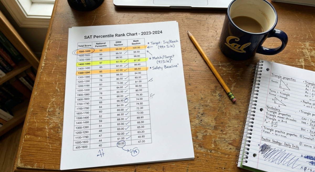
This table shows approximate user-group percentiles, which compare your score to recent SAT takers. These are the percentiles most students and colleges care about.
Composite Score | User-Group Percentile | Interpretation |
|---|---|---|
1600 | 99+ | Perfect score (fewer than 0.1% of test takers) |
1550 | 99+ | Elite, competitive for any school |
1500 | 98 | Highly competitive |
1450 | 96 | Strong for top-30 universities |
1400 | 93 | Competitive for top-50 universities |
1350 | 90 | Above average, solid for selective schools |
1300 | 86 | Well above average |
1250 | 81 | Above average |
1200 | 76 | Above average |
1150 | 69 | Slightly above average |
1100 | 63 | Average among test takers |
1050 | 55 | Near the middle |
1000 | 48 | Slightly below average for test takers |
950 | 39 | Below average |
900 | 32 | Below average |
800 | 17 | Well below average |
700 | 7 | Bottom decile |
600 | 2 | Near the floor |
400 | 1 | Minimum possible score |
Sources: College Board percentile tables and aggregated test prep data. Percentile values shift slightly each year as the testing population changes.
Want to see where your current performance falls before test day? Try a data-backed score predictor to get a section-by-section estimate.
SAT Section-Level Percentile Charts
The composite matters, but section scores tell you where to focus your prep. Here are approximate user-group percentiles for each section.
Reading & Writing (R&W) Percentiles
Section Score | Approximate Percentile |
|---|---|
800 | 99+ |
750 | 98 |
700 | 93 |
650 | 85 |
600 | 73 |
550 | 58 |
500 | 42 |
450 | 27 |
400 | 14 |
Math Percentiles
Section Score | Approximate Percentile |
|---|---|
800 | 99+ |
750 | 97 |
700 | 91 |
650 | 82 |
600 | 70 |
550 | 55 |
500 | 39 |
450 | 24 |
400 | 12 |
Math tends to be slightly more competitive at the top. A 750 in Math corresponds to roughly the 97th percentile, while a 750 in R&W reaches the 98th. The gap is small but consistent, reflecting fewer perfect or near-perfect Math scores in the testing population.
If one section is clearly weaker, that is where your time should go. Targeted SAT practice questions filtered by skill and difficulty level can close gaps faster than grinding full tests.
SAT Score Distribution
Score Range | Approximate Share of Test Takers |
|---|---|
1500-1600 | Top 2% |
1400-1490 | Next 5% |
1300-1390 | Next 7% |
1200-1290 | Next 10% |
1000-1190 | Middle 30% |
Below 1000 | Bottom 46% |
This distribution illustrates how scores cluster across the testing population.
How the SAT Score Chart Is Created
An SAT score chart is not just a simple lookup from “number correct” to “score.” There are several steps between filling in your last answer and receiving your 400 to 1600 composite. Understanding these steps explains why every score chart you find online includes the word “approximate.”
Step 1: Raw Score
Your raw score is simply the number of questions you answer correctly. There is no penalty for wrong answers. The Digital SAT has 54 Reading & Writing questions and 44 Math questions, for 98 total.
Step 2: Adaptive Module Routing
This is the part that confuses nearly everyone, and it is the single biggest change in how the Digital SAT works compared to the old paper test.
Each section has two modules. Module 1 is the same difficulty for all students. Based on your performance on Module 1, the system routes you to either a harder or easier Module 2. This routing directly affects the score range available to you.
If you’re routed to the harder Module 2, you can score up to 800 on that section. If you’re routed to the easier Module 2, your section score is capped. Estimates of this ceiling vary by source from roughly 590 to 700, with most experts placing it in the 660 to 700 range.
This means two students who answer the same total number of questions correctly can receive different scaled scores if they were routed to different modules.
Practitioners on Reddit’s r/Sat regularly post about the anxiety of realizing mid-test that they received the “easy” Module 2. The practical takeaway: Module 1 performance effectively sets a ceiling on your section score. Deliberately missing questions on Module 1 to get an easier Module 2 is a terrible strategy, because perfect performance on the easy module still cannot push your score past that cap.
Step 3: Equating (Raw to Scaled)
The College Board uses a statistical process called equating to convert raw scores to scaled scores (200 to 800 per section). This process adjusts for slight differences in difficulty between test administrations. A scaled score of 700 on one test date represents the same ability level as a 700 on another date, even if one test was slightly harder.
The College Board does not publish these conversion tables in advance. They are calculated after each administration.
Step 4: Composite Score
Your two section scores are added together. That sum, ranging from 400 to 1600, is your composite score, the number you see on your score report and the one most people mean when they say “SAT score.”
Step 5: Percentile Mapping
Your composite is then mapped to a percentile rank based on the performance of recent test takers. This is the number that tells you how you compare.
To establish your baseline before test day, free SAT practice tests that simulate the Digital SAT format can show you where you currently stand on the score chart.
Why Every Score Chart Says “Approximate”
Students searching for an SAT score chart want a definitive answer: “I got 48 out of 54 on R&W, so my section score is ___.” The frustration of finding only approximate tables is one of the most common complaints in test prep communities.
There are two reasons no chart can give you an exact answer for every test:
1. Equating varies by test form. Because each SAT administration is slightly different in difficulty, the raw-to-scaled conversion curve shifts. A raw score of 48 on a harder test might yield a higher scaled score than 48 on an easier test. The College Board adjusts the curve so the final scaled scores remain comparable, but the specific mapping changes.
2. Module path matters. As described above, whether you were routed to the hard or easy Module 2 changes the conversion. Two students with identical raw scores but different module paths will get different scaled scores.
What this means practically: your official score may differ by 10 to 30 points from any estimate you get from a practice test conversion chart. The charts in this article (and on every other website) are useful for planning and benchmarking, but your real score report is the only exact number.
For more on how the adaptive system works and how to prepare for it, see this guide on Digital SAT prep.
How Many Questions Can You Miss on the Digital SAT?
Because the Digital SAT uses adaptive modules, there isn't a universal answer.
However, these estimates provide a reasonable benchmark.
Target Score | Estimated Questions Missed |
|---|---|
1600 | 0-2 |
1500 | 5-8 |
1400 | 10-15 |
1300 | 18-25 |
1200 | 25-35 |
1100 | 35-45 |
These numbers vary depending on your module path and the specific test administration.
Students routed into the harder second module can miss more questions while maintaining a high score.
User Percentile vs. Nationally Representative Percentile
Your score report includes two percentile numbers, and most students don’t know why they’re different. The SAT score chart above uses user-group percentiles, but here’s the distinction:
User-group percentile compares your score to students who actually took the SAT recently. This is the more commonly referenced number and the one most relevant for college admissions context.
Nationally representative percentile estimates how you’d compare to all 11th and 12th graders in the United States, including those who never take the SAT. Because SAT takers skew more college-bound than the general high school population, your nationally representative percentile is typically higher than your user-group percentile.
For example, a 1200 is approximately the 81st percentile nationally but only the 76th percentile among actual SAT takers. The difference exists because students who don’t take the SAT would, on average, score lower if they did.
When you see percentiles in college admissions materials, they almost always refer to user-group percentiles. When you’re scanning an SAT score chart for admissions benchmarking, that is the column to focus on.
Percentile Gains Are Not Linear

This is one of the most underappreciated aspects of reading an SAT score chart, and most score chart pages skip it entirely.
The relationship between score points and percentile gain is not uniform across the scale. In the middle of the distribution (around 1000 to 1100), a 20-point improvement might move you up only 2 or 3 percentile points because there are many students clustered in that range.
Near the top, the curve gets steep. A 20-point improvement from 1450 to 1470 might jump you from the 96th to the 97th percentile, a difference that represents passing thousands of students. At the very top, each point matters disproportionately.
The practical implication: if you’re scoring around 1400 and targeting highly selective schools, even a small score increase carries significant percentile value. If you’re scoring around 1050, you’ll need a larger point gain to make a meaningful percentile shift, but those points are often easier to earn because there is more room for improvement in fundamental skills.
If you’re aiming for a 200-point gain, this step-by-step improvement plan breaks down how to get there efficiently.
What Is a Good SAT Score in 2026?
There isn't one universal definition of a good SAT score.
A good score depends on your goals, target colleges, and intended major.
Goal | Recommended SAT Score |
|---|---|
Meet college readiness benchmarks | 1010+ |
Gain admission to many public universities | 1100-1200 |
Apply to selective colleges | 1300-1400 |
Apply to top-50 universities | 1400-1500 |
Apply to Ivy League schools | 1500+ |
Generally, a score above 1200 is considered good because it places you above most SAT test takers.
Students pursuing engineering, mathematics, computer science, and other quantitative majors should place additional emphasis on their Math section score.
Is My SAT Score Good? Score-by-Score Guide
Your Score | Evaluation |
|---|---|
900 | Below average |
1000 | Slightly below average |
1100 | Average |
1200 | Good |
1300 | Very good |
1400 | Excellent |
1500 | Outstanding |
1600 | Perfect |
Many students search for specific scores rather than percentile charts. This table provides a faster way to interpret your results.
College & Career Readiness Benchmarks
Before thinking about admissions, it’s worth knowing the College Board’s own benchmarks for college readiness:
480+ in Reading & Writing indicates a 75% likelihood of earning at least a C in introductory college courses.
530+ in Math indicates a 75% likelihood of earning at least a C in college-level math.
These are not admissions targets. They are the floor for being prepared for college-level work. Most competitive colleges expect scores well above these benchmarks, but they provide useful context if you’re early in your prep and want to know what “ready for college” looks like in the College Board’s own terms.
How to Use the SAT Score Chart for College Planning
A score chart becomes genuinely useful when you connect it to specific schools. Here is how to do that:
Find Your Target Schools’ Middle 50%
Every college publishes its Common Data Set, which includes the 25th and 75th percentile SAT scores for enrolled students. This middle-50% range tells you the score window where most admitted students fall.
One important caveat: during the test-optional years (roughly 2020 to 2024), many students with lower scores chose not to submit them. This inflated the published score ranges for many schools. The numbers are normalizing as more institutions return to test-required policies (Harvard, MIT, Dartmouth, Brown, Penn, and Cornell among them), but keep this context in mind when looking at older data.
Based on Common Data Set reports, students aiming for top-50 U.S. universities in 2026 generally need scores between 1350 and 1550+.
Use Superscoring to Your Advantage
Most colleges, including all Ivy League schools, Stanford, MIT, Duke, and virtually every top-50 university, superscore the SAT. This means they take your highest Reading & Writing score and your highest Math score from different test dates and combine them into a new composite.
This has a direct impact on how you read the SAT score chart. If you scored 720 R&W and 680 Math on one sitting, then 690 R&W and 740 Math on another, your superscore is 720 + 740 = 1460. That composite falls at roughly the 96th percentile, even though neither individual sitting reached that level.
Superscoring makes retaking the SAT a lower-risk proposition. You only need to improve one section to raise your effective score.
Consider the ACT
If your SAT score chart position doesn’t match your target school range despite focused prep, the ACT may be a better fit for your testing style. Comparing the two tests before committing all your study hours to one is worth the small time investment.
SAT Score Targets by College Selectivity
College Type | Typical SAT Range |
|---|---|
Open-admission colleges | 900-1050 |
Regional public universities | 1000-1200 |
Flagship state universities | 1200-1400 |
Top-50 universities | 1350-1500 |
Ivy League schools | 1500-1580 |
These ranges represent general admissions trends rather than guaranteed thresholds.
Always compare your score against each institution's most recent Common Data Set.
Old SAT (2400 Scale) vs. Current SAT (1600 Scale)
If a parent, older sibling, or guidance counselor mentions their “1400 SAT,” it’s worth asking which scale they mean. The SAT underwent a major redesign in March 2016, shifting from a 2400-point scale to 1600. A 1400 on the old scale is not the same as a 1400 on the current scale.
A common shortcut is multiplying the old score by two-thirds (e.g., 2100 on the old scale ≈ 1400 on the new), but the College Board and test prep firms warn that section-by-section concordance tables are more accurate.
The Digital SAT, introduced in 2024, still uses the 1600 scale. The scoring mechanics changed (adaptive modules, no paper), but the scale itself remained the same.
Common SAT Score Chart Misconceptions
“My percentile means I got that percentage of questions right.” No. If your SAT score is in the 80th percentile, that means you scored higher than 80% of test takers. It says nothing about how many questions you answered correctly. A student answering roughly 70% of questions correctly would score approximately 600 to 650 per section, or about 1200 to 1300 total.
“There’s one correct conversion chart for every SAT.” There isn’t. The raw-to-scaled conversion varies by test date due to equating. Practice test conversion tables are approximations based on past administrations.
“Nationally representative percentile is better than user percentile.” It’s higher, not better. Colleges compare you to other test takers (user percentile), not to the entire U.S. high school population.
“A 1600 is common among top school applicants.” Fewer than 1% of all test takers achieve a perfect 1600. In a typical year, that is roughly 1,500 to 2,000 students out of approximately 2 million. A perfect score is not required for admission anywhere.
National Average and Key Benchmarks at a Glance
Benchmark | Score |
|---|---|
National average (2025) | 1029 |
Average R&W section | 521 |
Average Math section | 508 |
90th percentile | ~1350 |
75th percentile | ~1200 |
50th percentile (median) | ~1010 |
College readiness (R&W) | 480+ |
College readiness (Math) | 530+ |
Perfect score | 1600 |
Source: College Board and OntoCollege reporting.
Frequently Asked Questions
What is the highest possible SAT score?
The highest SAT score is 1600, the sum of a perfect 800 in Reading & Writing and a perfect 800 in Math. Fewer than 2,000 students per year achieve it out of roughly 2 million test takers.
What is the average SAT score in 2025-2026?
The national average is approximately 1029, with an average of 521 in Reading & Writing and 508 in Math. Because the average falls below 1100, any score above 1100 puts you above the majority of test takers.
What SAT score is the 90th percentile?
A composite score of approximately 1350 places you at or near the 90th user-group percentile. This means you scored higher than 90% of recent SAT takers.
How do I convert my raw score to a scaled score?
You cannot do it precisely without the specific conversion table for your test date, which the College Board publishes only after scoring. Practice test conversion tables give reasonable estimates, but expect your actual score to vary by 10 to 30 points.
What’s the difference between user percentile and nationally representative percentile?
User percentile compares you to students who actually took the SAT. Nationally representative percentile compares you to all U.S. 11th and 12th graders, including those who never sit for the test. Your nationally representative percentile will be higher. Colleges use the user-group number.
Do colleges look at percentiles or composite scores?
Colleges primarily look at composite scores and section scores. Percentiles provide context, but admissions offices evaluate your score against their institutional data (middle-50% ranges), not against a generic percentile chart.
Does the adaptive module system affect my score chart lookup?
Yes. Because the Digital SAT routes you to a harder or easier Module 2 based on your Module 1 performance, two students with the same raw score can receive different scaled scores. Any SAT score chart you find online is an approximation that doesn’t account for your specific module path. Your official College Board score report is the definitive number.
Should I retake the SAT if my score is below my target school’s range?
In most cases, yes. With over 1,000 colleges superscoring, you only need to improve one section to raise your effective composite. A structured study plan focused on your weaker section, supported by free practice exams and a diagnostic, is the most efficient path.